
Code-related feedbacks, suggestions and ideas
I -think- what he is saying is that for a font to show for everyone, either everyone needs to have the font on their device (so everyone needs to download Comic Sans to see Comic Sans) or the website itself needs to provide Comic Sans to that it can be used. That the data the site would have to provide to offer several fonts to show would be heavy on the site itself because while you might write your post entirely in Helvetica, I am writing mine in Garmond and someone else is writing their whole post in Papyrus. This means the site needs to provide the data to display all of these fonts. If I am wrong Zach, feel free to correct me.
As for fonts, looking for a limited list of fonts these were a few thoughts I had (so feel free to ignore).
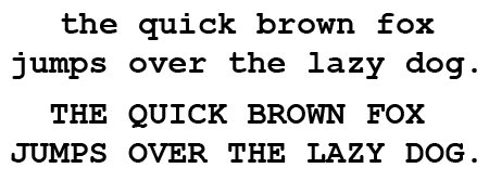
"Typewriter Font"
A monospace font (for "typewriter") Courier New, it is available on mac and windows and is replaced with Cousine on Android devices. This might be a simple option for those looking for a monospace sort of font or for those that wish to use a "typed" media appearance aesthetically.
Alternative Paragraph Fonts
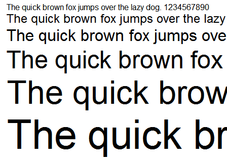
The Arial font is a dyslexia friendly font for paragraph use that is available on mac and windows and is replaced with Arimo on Android devices. This has more write space in the letters for ease of reading for users. I know we also had a dyslexia font in the past that was being used by a minority that might even still be loaded someplace, it probably is similar to this in fact.
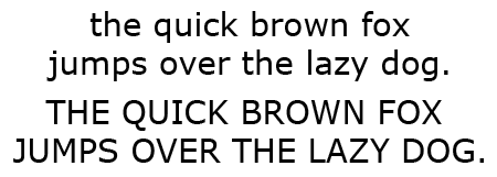
The Verdana font is another "good" font for paragraph use because it does not have those extra small flourishes, simple lettering. This font is good at a variety of sizes, including smaller type and people who have poor resolution on their screens so might struggle with other fonts. It is available in Windows and Mac, however I do not see this offered in Android so would need support for that.
Handwritten Print
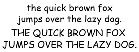
The Comic Sans font is available on mac and window devices and serves as a handwritten sort of font, however this font is not available I think on all mobile devices. However this is another dyslexia-friendly font so for hand-written print it is one of my favorite options to advocate for because of universal ease in reading.
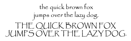
The Papyrus font is available on Windows and Mac but again we seem to lack an Android option. While this is one of those love it or hate it fonts, it might be another consideration.
Headers
Impact is available on both mac and windows. Again, fonts are somewhat limited on android devices.
Arial Black is another option on both mac and windows. This is a bit wider than Impact but again I do not think this has any android representation.
Cursive
Going to be honest, searched all day and I found a ton of great cursive fonts but they were either hard to read or they were available on one system only. I personally suggest using 𝓪 𝓾𝓷𝓲𝓬𝓸𝓭𝓮 𝓻𝓮𝓼𝓸𝓾𝓻𝓬𝓮 𝕥𝕙𝕒𝕥 𝕒𝕕𝕕𝕤 𝕟𝕠 𝕨𝕖𝕚𝕘𝕙𝕥 𝕥𝕠 𝕥𝕙𝕖 𝕤𝕚𝕥𝕖 𝖇𝖚𝖙 𝖆𝖑𝖑𝖔𝖜𝖘 𝖕𝖑𝖆𝖞𝖊𝖗𝖘 𝖙𝖍𝖊 𝖋𝖗𝖊𝖊𝖉𝖔𝖒 𝖔𝖋 𝖚𝖘𝖎𝖓𝖌 𝖋𝖆𝖓𝖈𝖞 𝖋𝖔𝖓𝖙𝖘.
If I were to have a wish-list, I would be asking for a typeface of some sort (like Courier New or any monospace really), some sort of alternative paragraph font since it seems that some of the players here have some strong sentiments regarding fonts (perhaps the return of the dyslexia font we had before but as an option players an just use for their post), some sort of header font (I am a personal fan of Impact since it looks distinctly different from the other fonts), and then some sort of hand-written font (I find papyrus annoying personally but would honestly take any, comic sans is a simple and common font that has great readability). I cannot find a darn thing that is commonly found on multiple platforms for cursive.
As for fonts, looking for a limited list of fonts these were a few thoughts I had (so feel free to ignore).
"Typewriter Font"
A monospace font (for "typewriter") Courier New, it is available on mac and windows and is replaced with Cousine on Android devices. This might be a simple option for those looking for a monospace sort of font or for those that wish to use a "typed" media appearance aesthetically.
Alternative Paragraph Fonts
The Arial font is a dyslexia friendly font for paragraph use that is available on mac and windows and is replaced with Arimo on Android devices. This has more write space in the letters for ease of reading for users. I know we also had a dyslexia font in the past that was being used by a minority that might even still be loaded someplace, it probably is similar to this in fact.
The Verdana font is another "good" font for paragraph use because it does not have those extra small flourishes, simple lettering. This font is good at a variety of sizes, including smaller type and people who have poor resolution on their screens so might struggle with other fonts. It is available in Windows and Mac, however I do not see this offered in Android so would need support for that.
Handwritten Print
The Comic Sans font is available on mac and window devices and serves as a handwritten sort of font, however this font is not available I think on all mobile devices. However this is another dyslexia-friendly font so for hand-written print it is one of my favorite options to advocate for because of universal ease in reading.
The Papyrus font is available on Windows and Mac but again we seem to lack an Android option. While this is one of those love it or hate it fonts, it might be another consideration.
Headers
Impact is available on both mac and windows. Again, fonts are somewhat limited on android devices.
Arial Black is another option on both mac and windows. This is a bit wider than Impact but again I do not think this has any android representation.
Cursive
Going to be honest, searched all day and I found a ton of great cursive fonts but they were either hard to read or they were available on one system only. I personally suggest using 𝓪 𝓾𝓷𝓲𝓬𝓸𝓭𝓮 𝓻𝓮𝓼𝓸𝓾𝓻𝓬𝓮 𝕥𝕙𝕒𝕥 𝕒𝕕𝕕𝕤 𝕟𝕠 𝕨𝕖𝕚𝕘𝕙𝕥 𝕥𝕠 𝕥𝕙𝕖 𝕤𝕚𝕥𝕖 𝖇𝖚𝖙 𝖆𝖑𝖑𝖔𝖜𝖘 𝖕𝖑𝖆𝖞𝖊𝖗𝖘 𝖙𝖍𝖊 𝖋𝖗𝖊𝖊𝖉𝖔𝖒 𝖔𝖋 𝖚𝖘𝖎𝖓𝖌 𝖋𝖆𝖓𝖈𝖞 𝖋𝖔𝖓𝖙𝖘.
If I were to have a wish-list, I would be asking for a typeface of some sort (like Courier New or any monospace really), some sort of alternative paragraph font since it seems that some of the players here have some strong sentiments regarding fonts (perhaps the return of the dyslexia font we had before but as an option players an just use for their post), some sort of header font (I am a personal fan of Impact since it looks distinctly different from the other fonts), and then some sort of hand-written font (I find papyrus annoying personally but would honestly take any, comic sans is a simple and common font that has great readability). I cannot find a darn thing that is commonly found on multiple platforms for cursive.
There is something about ambition, how it not only propels you but also defines you.

Code-related feedbacks, suggestions and ideas
Thanks. I'll do my best, currently working on it to provide some options which will work on all devices.
However, I'm only considering the Comic Sans MS for a future April Fool's Day.
Moreover, regarding dyslexia, this site had an option for almost three years to use Open Dyslexic, and... nobody ever used it. So, for those concerned, I invite you to use an extension (OpenDyslexic for Chrome, Mobile Dyslexic for Firefox).
However, I'm only considering the Comic Sans MS for a future April Fool's Day.
Moreover, regarding dyslexia, this site had an option for almost three years to use Open Dyslexic, and... nobody ever used it. So, for those concerned, I invite you to use an extension (OpenDyslexic for Chrome, Mobile Dyslexic for Firefox).

Code-related feedbacks, suggestions and ideas
Hi Zach,
I noticed the text boxes have been widened and I am wondering if that is intentional and if so will it be a permanent feature?
Thanks!
-Winnie
I noticed the text boxes have been widened and I am wondering if that is intentional and if so will it be a permanent feature?
Thanks!
-Winnie
│ │ | │ │ | STA: 15 • EVA: 18 • STR: 8 WIS: 11 • ARC: 7 • ACC: 17 | │ │ | • Healing Sage • Muggle Condition • Paragon of Health • • Poison Resistance • Animagus • Wandmaker • Lovely Creature • | │ │ | │ │ |

Code-related feedbacks, suggestions and ideas
Not answering for Zach but, I don't notice a difference. It looks the same to meWinnie Harper wrote: 6 Apr 2022, 20:56 Hi Zach,
I noticed the text boxes have been widened and I am wondering if that is intentional and if so will it be a permanent feature?
Thanks!
-Winnie
"I wish nothing but the best for you." - Adele
Code-related feedbacks, suggestions and ideas
I only brought up the dyslexia font because you might already have it. Trying to give you less work. I am sure whatever you come up with will be great.
There is something about ambition, how it not only propels you but also defines you.
Code-related feedbacks, suggestions and ideas
I would assume it was just me being silly and making the site larger but others have noticed it in the Let's Chat so it is not just me.Noah Jupe wrote: 6 Apr 2022, 21:00Not answering for Zach but, I don't notice a difference. It looks the same to meWinnie Harper wrote: 6 Apr 2022, 20:56 Hi Zach,
I noticed the text boxes have been widened and I am wondering if that is intentional and if so will it be a permanent feature?
Thanks!
-Winnie

│ │ | │ │ | STA: 15 • EVA: 18 • STR: 8 WIS: 11 • ARC: 7 • ACC: 17 | │ │ | • Healing Sage • Muggle Condition • Paragon of Health • • Poison Resistance • Animagus • Wandmaker • Lovely Creature • | │ │ | │ │ |
Code-related feedbacks, suggestions and ideas
Yes! I went from 14px to 16px, and finally 15px.
Code-related feedbacks, suggestions and ideas
Perfect, thank you Zach! 
│ │ | │ │ | STA: 15 • EVA: 18 • STR: 8 WIS: 11 • ARC: 7 • ACC: 17 | │ │ | • Healing Sage • Muggle Condition • Paragon of Health • • Poison Resistance • Animagus • Wandmaker • Lovely Creature • | │ │ | │ │ |
Code-related feedbacks, suggestions and ideas
Here are some tests (which will not be identical on the different platforms but should nevertheless have similar rendering):
Lorem ipsum dolor sit amet.
Lorem ipsum dolor sit amet, consectetur adipiscing elit, sed do eiusmod tempor incididunt ut labore et dolore magna aliqua. Ut enim ad minim veniam, quis nostrud exercitation ullamco laboris nisi ut aliquip ex ea commodo consequat. Duis aute irure dolor in reprehenderit in voluptate velit esse cillum dolore eu fugiat nulla pariatur. Excepteur sint occaecat cupidatat non proident, sunt in culpa qui officia deserunt mollit anim id est laborum.
Lorem ipsum dolor sit amet, consectetur adipiscing elit, sed do eiusmod tempor incididunt ut labore et dolore magna aliqua. Ut enim ad minim veniam, quis nostrud exercitation ullamco laboris nisi ut aliquip ex ea commodo consequat. Duis aute irure dolor in reprehenderit in voluptate velit esse cillum dolore eu fugiat nulla pariatur. Excepteur sint occaecat cupidatat non proident, sunt in culpa qui officia deserunt mollit anim id est laborum.
Lorem ipsum dolor sit amet.
Lorem ipsum dolor sit amet, consectetur adipiscing elit, sed do eiusmod tempor incididunt ut labore et dolore magna aliqua. Ut enim ad minim veniam, quis nostrud exercitation ullamco laboris nisi ut aliquip ex ea commodo consequat. Duis aute irure dolor in reprehenderit in voluptate velit esse cillum dolore eu fugiat nulla pariatur. Excepteur sint occaecat cupidatat non proident, sunt in culpa qui officia deserunt mollit anim id est laborum.
Lorem ipsum dolor sit amet, consectetur adipiscing elit, sed do eiusmod tempor incididunt ut labore et dolore magna aliqua. Ut enim ad minim veniam, quis nostrud exercitation ullamco laboris nisi ut aliquip ex ea commodo consequat. Duis aute irure dolor in reprehenderit in voluptate velit esse cillum dolore eu fugiat nulla pariatur. Excepteur sint occaecat cupidatat non proident, sunt in culpa qui officia deserunt mollit anim id est laborum.
Code-related feedbacks, suggestions and ideas
Wow, looks great. Thank you. Because players will (cough drive me crazy asking) what are these technical fonts on the varied devices?
There is something about ambition, how it not only propels you but also defines you.